Developer Journal 3: Adding some color to the world
- Posted at
- .

A heightmap generated from the Diamond-Square algorithm. Now, let's add some color to it!
Hi all,
In my last developer journal I outlined a method of generating terrain heightmaps. In this entry, I’m going to show a method for generating a texturemap, which will add color to the terrain in game. The purpose of this is obvious: to create a wide variety of environments. Who wants to play a totally black and white game anyway?**

A diagram of the colors of the forest theme.

The linear gradient doesn't look half bad in game either!
**I jest. Limbo is still one of my favorites from 2011.
Color Terrain Based on Height
Our first thought for making realistic(ish) terrain was to use the height of the map at a point to inform that point’s color. This will allow for randomly generated terrain to have some variance without the player/map designer having to get their hands too dirty.

This rainbow world theme was inspired by Star Control 2.

The square of distance algorithm produces sharper lines between points.
Enter the Theme
We chose to implement what we are calling themes. A theme is a sequence of color and height pairs. These color height pairs are used for generating colors for every possible height in the game world. All the map designer needs to do to get something up and running is to specify a few height, color pairs and BAM!, they’ll have a new map ready for playing in.
Each theme is a list of height and color (RGB) pairs. Here’s a sample that was used for the forest theme:
forest_theme = {
    0:(82, 210, 106),
    30:(138, 202, 86),
    100:(44, 116, 64),
    140:(33, 65, 41),
    180:(127, 124, 84),
    200:(100, 100, 100),
    250:(255, 255, 255)
    }
That’s it!
Linear Gradient
All that says is, “The color (82, 210, 106) was specified for a height of 0; the color (138, 202, 86) was specified for height 30” and so on. Interpolating the color between any two points is a simple matter of calculating a weighted mean based on where the height lies between the two heights. If the height is 29, the color should look almost like the height specified at 30, whereas if the height is 15, it should be halfway between the color at 0 and the color at 30.
Once we calculate what the color should be at any given height, we plow through the heightmap and translate each height into a color and save the file as a texturemap image.
This gets us some decent looking terrain with little hassle. If you have experience working with gradients in Adobe Photoshop (or any other graphics editor, for that matter), you’ll recognize the effect that we end up with: a nice smooth gradient from one color to the next to the next to the next…

The texturemap with shadows applied looks great here...

...but in game it leaves much to be desired.
Square of Distance Gradient
In addition to the linear gradient mode, we also worked to create another interpolation method, which I like to call the square of distance method. For a given height H, the algorithm calculates the height’s distance from every point defined in the theme. Then, it calculates the amount of weight each color should have based upon the distance’s square.
Notice the vast differences in the sample? No, I don’t either. The edges are a little sharper and that makes it worth the extra work (maybe).
Make Noise
One thing that I noticed very quickly was that the uniform terrain was, well, boring. Because both methods of interpolating colors mapped a color to a height, every height of 5 ended up looking like every other height of 5. It was glaringly obvious that the colored terrain needed something more to make it shine. It needed a bit of noise.
Adding noise ended up being simple: for each height there is a specific color assigned, but each time that color is applied we can add or subtract a bit of color. I decided that it would probably be best to add or subtract red, green, and blue in equal amounts to change the shade only. This extra noise made the terrain more varied while still keeping with the theme’s color scheme.
Shadows, Round 1
Finally, we attempted to add shadows to the texturemap. This was much less successful than other parts of our programming adventure. Essentially we tested the height of all points and darkened the shade of the current point if to its West was a point with a greater height and it hadn’t already been darkened. This part of the terrain generator definitely needs more work.

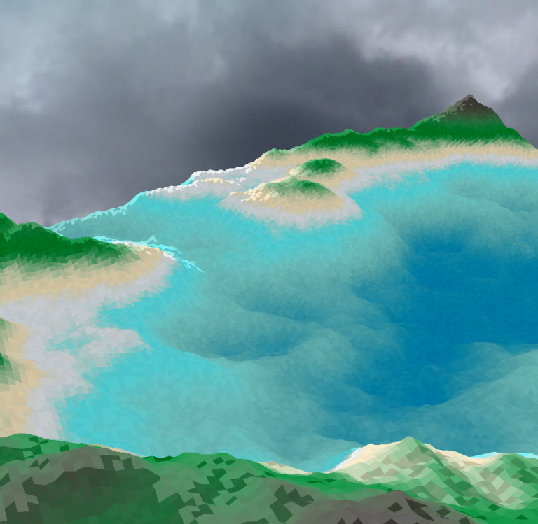
I like long walks along digital beaches.
Success?!
I was walking home from work not two days after I had finished working on the texture generator functions for our game when I had a moment of clarity while staring at the carefully maintained grass on campus: our initial idea of mapping a color to a height is a good starting point, but it doesn’t adequately resemble what is seen in the real world or what could be imagined in a game world; it was much too uniform, even with basic shadows, noise, and color blending.
Now, if only there were a way to allow the map designer to add colors or color mixes to specific parts of the map. Or to allow for a base layer to be painted with colors on top of it. Hmm, that is the next task! But first, I’m going for a walk in my tropical theme!
Cheers,
S
Comments